

3.5. Color in Interior Design: A Guide for European Tastes and Standards
When developing the interior design of a home, one of the most crucial tasks is to tastefully select a color palette. The choice of color influences the thoughts and emotions people experience in a room and can affect their mood. Color can visually expand or contract a space, highlight functional zones, or ‘lift’ the ceiling. Unfortunately, many approach color selection superficially, relying solely on their instincts, often leading to a lack of taste and measure. This can result in bedrooms in stark black tones or studies in bold magenta, making the spaces uncomfortable for sleeping or working. Let’s explore how to correctly choose colors for your apartment or house interiors while avoiding common pitfalls.
Common Mistakes in Interior Color Selection
Interestingly, even professional designers sometimes struggle to identify what counts as a mistake in color selection. However, some general missteps in room design include:
- Creating interiors solely in one color, often white, a common mistake among amateurs.
- Using overly bright colors and improper combinations, like grey paired with bright orange.
- Mixing different colors in equal amounts; it’s better to use one color as the main hue and others as accents.
- A complete absence of contrasting elements, making the interior monotonous and uninteresting.
How, then, should you approach defining the color palette correctly? Let me share my “helpers.”
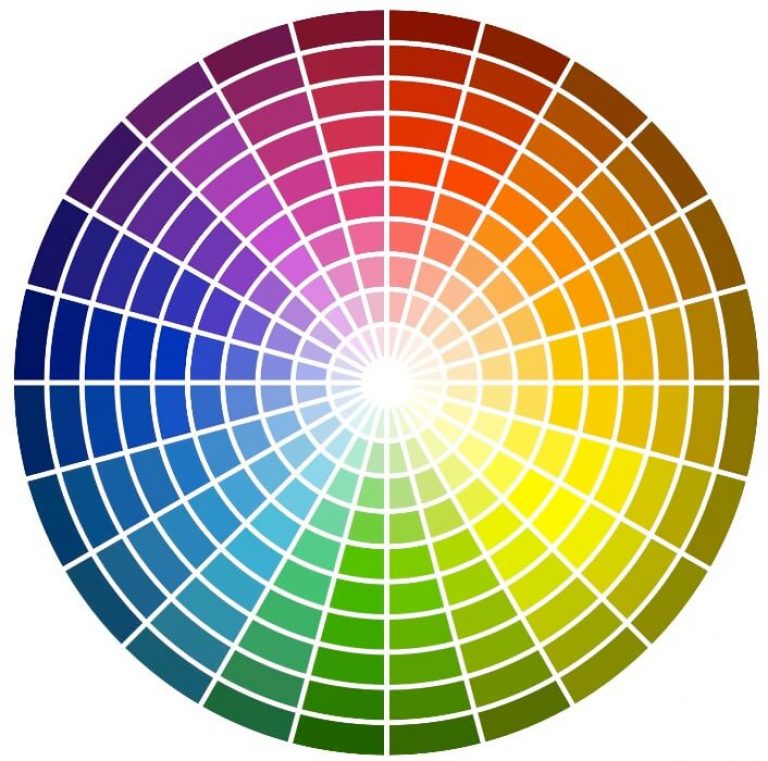
Selection Using the Color Triangle
This model, devised by Johannes Itten, consists of a triangle with corners in red, blue, and yellow, with green, purple, and orange along its edges. The triangle is inscribed in a circle divided into 12 sectors with the main colors of the spectrum. Rotating the triangle in the center of the circle shows the color resulting from the mixture of colors at the triangle’s points.

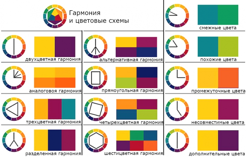
Harmonious colors are considered those opposite each other. Rotating the triangle provides the most suitable color combinations.
For a more comprehensive range of colors, I prefer using color.adobe.com. This enhanced model operates on the same principle and suggests the most suitable color combinations in several modes: monochromatic, contrast, triadic, tetradic, analogous, and accent analogous. This program is an excellent tool for both novice and experienced designers.
Color Schemes
Each design specialist creates a set of harmonious palettes for different color sections. This comes with experience, and I often use my color schemes, offering interesting ideas for mixing tones. For instance, I have a scheme “Apples: Blossom and Sunlight” for kitchen design, and “Tropical Palm House” for decorating bedrooms, combining ivory with green foliage and light purple accents.
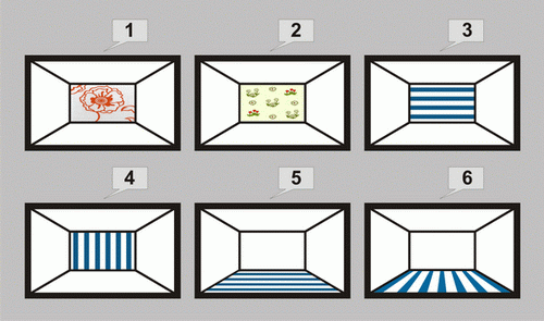
Changing Space with Color
To visually enlarge a room, paint walls and ceilings in the same color or choose a common texture. This is typical for country house interiors.
- Lengthen a room using lighter floors, ceilings, and the far wall. However, the floor should be slightly darker.
- A darker far wall visually shortens the space.
- For an office, the “jewelry box” effect with a light ceiling and dark walls visually reduces the room, creating an atmosphere of intimacy and confidentiality.
- Light-colored floors, ceilings, and walls can create a spacious yet cold feeling, which can be mitigated by warm and bright-toned details.
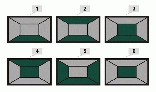

For a study, the “box” effect – a room with a light ceiling and dark walls – visually reduces the room size, creating an atmosphere of intimacy and confidentiality. If the floor, ceiling, and walls are light in color, the room may feel spacious but cold. Here, details in warm and bright tones can help..
This is what I wanted to share about choosing colors in interior design. To avoid mistakes in decorating your home, consult with me, interior designer Olesya Blashchenko. I’ll help you select the optimal color palette for your home’s rooms, calculate the painting and finishing budget, and choose the necessary paints and materials.
